Besides realising that our interactive group is quite small and we all have similar ideas, morag and i received some positive feedback from the group.
we decided to develop our idea, which involves some ideas which at the moment morag and i have no idea whether will be possible or not.
the first change is to have less phidgets. we are hoping to keep it to at least 4. one being a joy stick which the user can actually draw their own pictures on the screen. one vibration sensor. one slider. and one stop button. we also thought it would be quite a good idea to include a stop button so the picture the user has created will be able to be printed out on a business card sized card with the details of the art gallery on the back which would be sold at the till for £1 per card. kind of like a souvenier.
Thursday, February 21, 2008
Monday, February 18, 2008
Trippy Blobs
this reminds me of lights in a club. probably a bit to trippy to be having in a gallery cafe.
Sunday, February 17, 2008
Alternative Idea
This is just another thought to the visuals for the mixer. If each sensor was connected to a word and you have to make up your own sentences. A bit like fridge magnets. But this animation is just using a random word and making a bit of a loopy pattern. Not really sure where I am going with this idea but it was fun to make. I think if our visuals were to be words rather than pictures it seems a little more intellectual for our target audience. The reason I wanted an alternative idea is because I told my mum the idea who is a typical art gallery goer and she was like....'yeah so whats the point'. Maybe if the animations did have words the it would have more of a 'point'. But then should they have a point, isn't the purpose of all art that you make your own point??
BHF Food For Thought
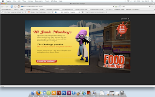
This website is for the British Heart Foundation by the Design Company Fingal and aims to promote childrens awareness to the mass amount of advertising aimed at them for junk food.
The website creates a whole virtual 3d world with 20 tasks designed to educate the kid aswell as entertain them. The games include the 'burp-o-meter', 'grub tub' and 'vending machines'. Once I completed a few of the tasks I realised slowly that the website was getting me to enter quite alot of personal information. I made it up because I wanted to get to the end of the challenge for the chance to win some anti-gravity boots! But on the other hand children may not be as clever. To my surprize their was then a warning to the kids to be careful about how much personal information they actually disclose on the internet which I thought was definalty something which needs to be warned to everyone who uses the internet.
http://food4thought.bhf.org.uk/
The website creates a whole virtual 3d world with 20 tasks designed to educate the kid aswell as entertain them. The games include the 'burp-o-meter', 'grub tub' and 'vending machines'. Once I completed a few of the tasks I realised slowly that the website was getting me to enter quite alot of personal information. I made it up because I wanted to get to the end of the challenge for the chance to win some anti-gravity boots! But on the other hand children may not be as clever. To my surprize their was then a warning to the kids to be careful about how much personal information they actually disclose on the internet which I thought was definalty something which needs to be warned to everyone who uses the internet.

http://food4thought.bhf.org.uk/
White Void
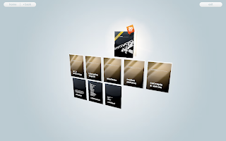
White Void is an company specialising in interactive design, product design, media design interior architecture and electronic engineering. The company created interactive products for museums, exhibitions, trade fairs, fesitvals, clubs and concerts.
The website is pretty cool to use as it is all in little 3d folders with each different area of specialism in different boxes:
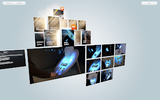
White Void designed a pretty interesting interactive kiosk for OTICON Denmark, and OTICON USA called 'Head Over Heels'. 'Head Over Heels' is a stand alone Kiosk system and has intergrated computer and video projection systems. There are touch sensors at the bottom of the screen to allow for complete user interaction.
http://www.whitevoid.com
The website is pretty cool to use as it is all in little 3d folders with each different area of specialism in different boxes:

White Void designed a pretty interesting interactive kiosk for OTICON Denmark, and OTICON USA called 'Head Over Heels'. 'Head Over Heels' is a stand alone Kiosk system and has intergrated computer and video projection systems. There are touch sensors at the bottom of the screen to allow for complete user interaction.

http://www.whitevoid.com
Animation Review
The blue circle animations are two rough ideas for the animations we can use as part of our visual mixer interactive kiosk. The idea is that it doesn't take up too much of the screen so that other animations can be mixed on top of this. I don't think this looks particularly pleasing on the eye, it is just somev rough ideas so when Morag and I meet up tomorrow we can play around with some animations and then use some scripting to see how it works with each of the sensors.
Tuesday, February 12, 2008
Design Ideas 2 - Visual Mixer
This is our intitial idea for the project.We hope to have this on a table in the cafe. The fidgets we intend to use are touch sensors, vibration sensors, sliders, a joystick and a light sensor. We will use Actionscript 3.0 scripting to link the fidgets to the computer screen (which in reality would be the table in the cafe). When the fidgets are activated there will be 4 short animations which can be mixed visually because they will be able to overlap. The slider in the middle will alter the colour of all the animations. We will either make the animations opaque or just quite sparse so they will be able to mix smoothly.
The picture in the middle of this diagram is taken from this website:
www.wellcomecollection.org/exhibitionsandevents/onlineexhibits/index.htm
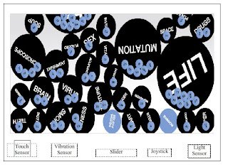
It is made in a similar way to how we would like our first animation to look, although we would make it look more like smarties falling and put the circles in different colours and not have any text.
The picture in the middle of this diagram is taken from this website:
www.wellcomecollection.org/exhibitionsandevents/onlineexhibits/index.htm

It is made in a similar way to how we would like our first animation to look, although we would make it look more like smarties falling and put the circles in different colours and not have any text.
Design Ideas
Today things started to get exciting for Morag and I in our project as we made quite a few significant decisions.
The brief is to 'Design and present your ideas and working prototype for an interactive kiosk/advertising with AV content'.
We decided to make our kiosk for is the cultural industry, inside an art gallery’s cafe. We will not be conveying information via our kiosk; neither will we be advertising a product. Our kiosk is purely for the purpose of art, to incorporate interaction into the gallery café.
Sometimes café’s are a let down for the gallery as they provide no inspiration for the customers. They are usually just clean and clinical looking with no real thought behind the decoration, and often quite overpriced.
However with our idea, we propose to add something a little more exciting to the experience and hope to continue the creative sparks flying before the customer leaves the gallery.
Subscribe to:
Comments (Atom)